Scarlet Honolulu
2023-present
Voted Hawaii’s Best LGBTQIA+ Bar/Club by Honolulu Magazine for three years in a row (2023, 2024, and 2025), Scarlet Honolulu has become a staple of Honolulu’s LGBTQIA+ community, and becoming a creative director of its visual identity has been a great honor. Scope of work began with event fliers and posters, eventually transitioning into print media, signage, merchandising, and more over the years.
Restaurant Week Hawaii presents:
The World Noodle Festival
2021
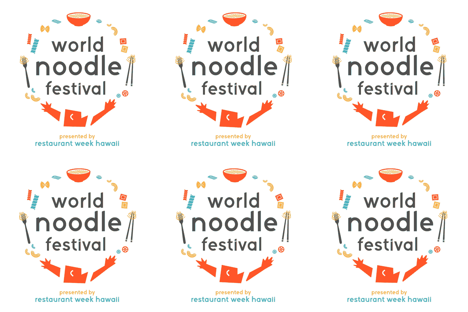
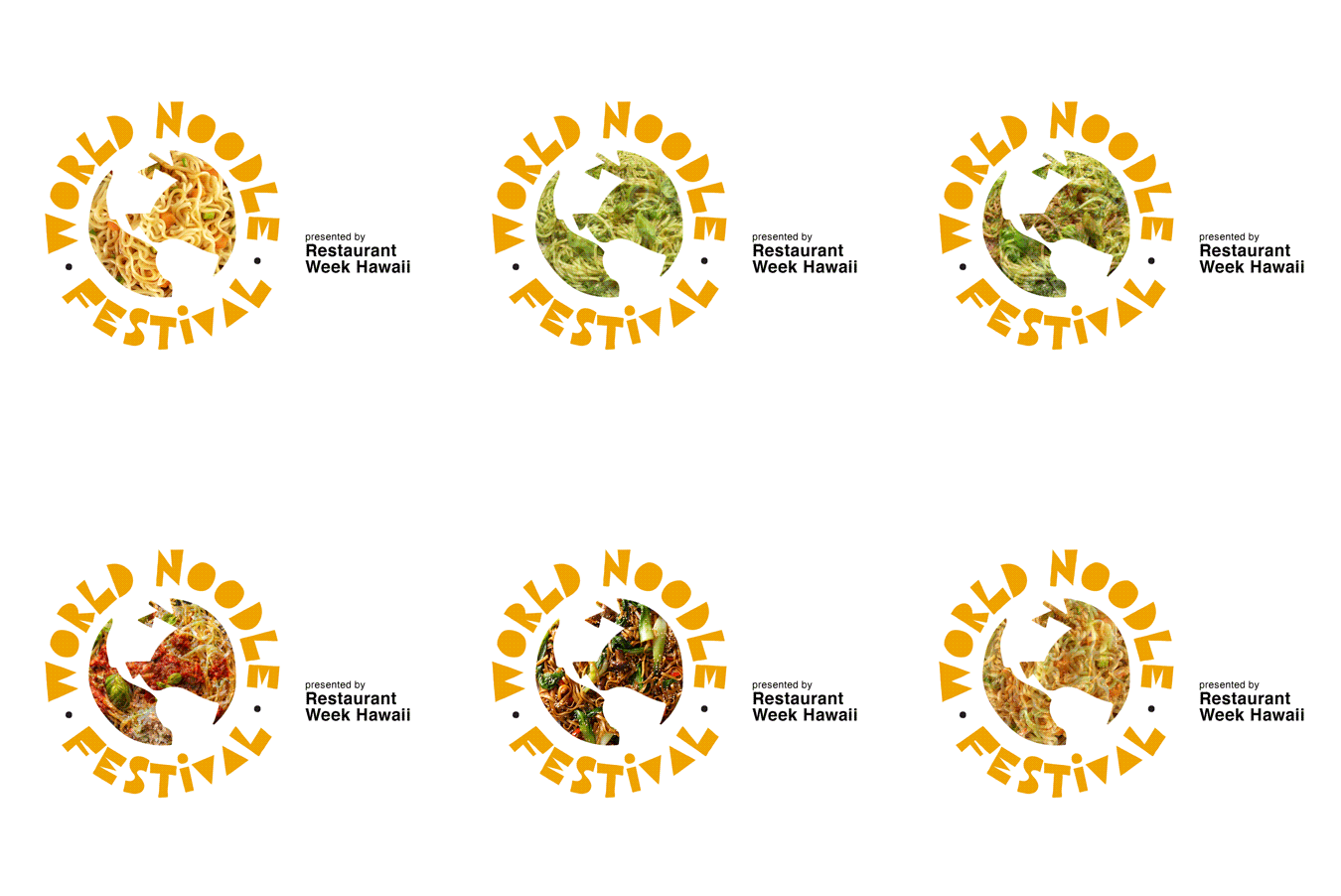
Conceptualized as a periodic celebration of various dishes and cuisines, Restaurant Week Hawaii transitioned into World Noodle Festival in 2021. Celebrations of other dishes and cuisines (spices, rice dishes, etc.) were intended for later down the line, so icons, words, and imagery within the logo were designed to be accordingly interchangeable.
The final logo (above), as well as some earlier options (below) were designed to have a playful, celebratory feel.
Created at Core Group One, Inc.
O‘ahu Mutual Aid
2021
Logo options for O‘ahu Mutual Aid, a not-for-profit volunteer houseless aid effort started by my friends and I. OMA was a spinoff of Coronacare Hawaii, established during the pandemic to provide food, supplies, and resources to households across the island who were immunocompromised or unable to provide for themselves during the pandemic.
GRAVES
“HILO” Album Campaign
2017
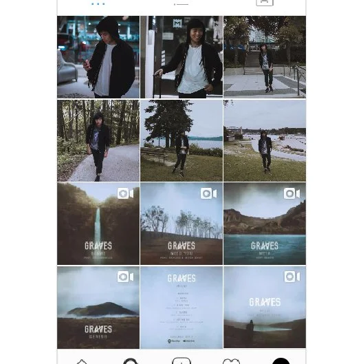
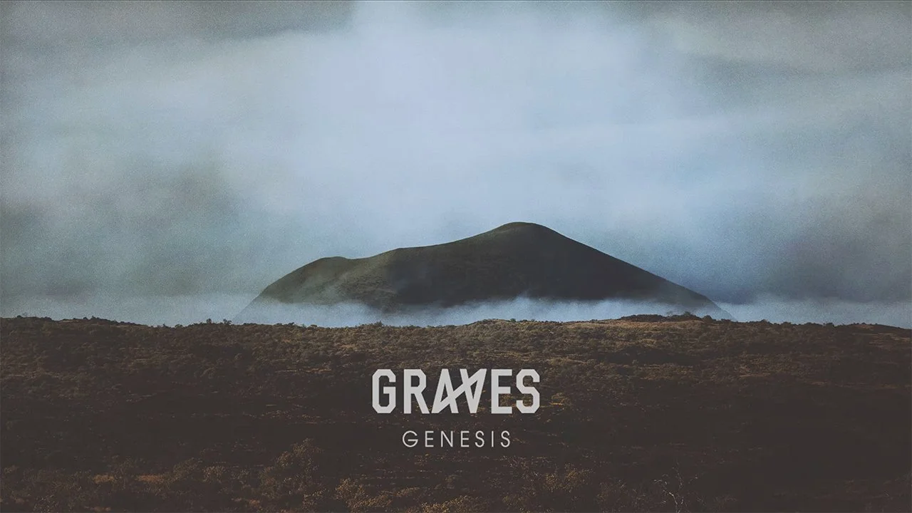
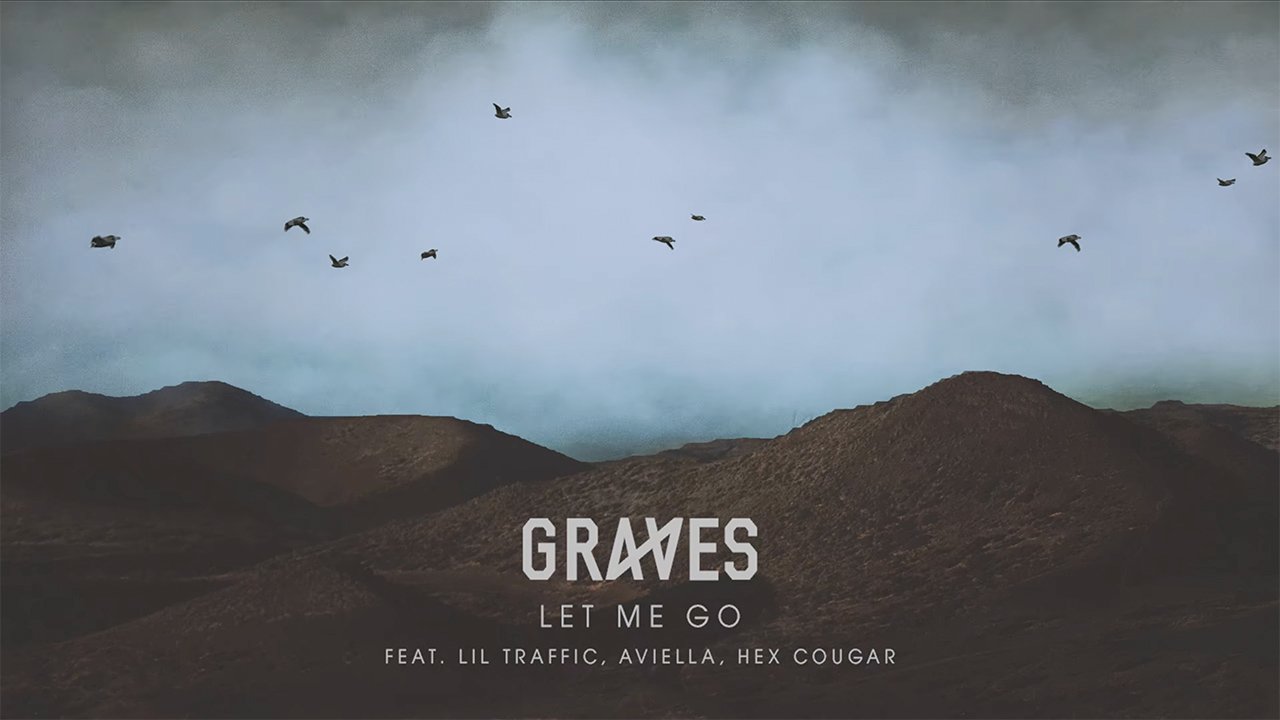
As a part of the release of his 2017 EP, “HILO”, Hawaii-based EDM artist GRAVES established an elaborate rollout campaign, complete with physical print takeovers, a matching unified social media aesthetic, artwork for each track in the EP (featuring photography of various locations around Hilo), and accompanying animated visualizers for each track’s artwork. The campaign was a huge success, with the EP topping the iTunes Electronic Albums Chart upon its release.
Creative Direction by Christopher Ahn
The HILO Album Visualizer set is a winner of a “Hawaii’s 5-O”, AIGA Honolulu’s biennial award show recognizing the period’s top 50 examples of graphic design excellence in Hawaii.
The Great Aloha Run:
“Sharing ALoha”
2017
Tagline logos for the 2017 Great Aloha Run (the second largest road race in Hawaii). Each tagline logo was created with the intent of it being used in conjunction with the traditional "Great Aloha Run" logo.
The first option was hand-lettered, with as many letters "sharing" connecting lines as possible, loosely forming the shape of a heart. This became the 2017 logo for the event.
The second option turned the petals of two adjacent hibiscus flowers into stretched hands, reaching to "share" each others' "aloha." This logo was later turned into a "In-Training" shirt for the same event.
The third option, pictured above, simply uses the anthurium's heart shape to describe shared "aloha" (or, love). This logo was later used to create a volunteer shirt, also for the same event.
Created at Core Group One, Inc.
iAGE Channel
2015
iAGE Channel is a partnership with Core Group One and Oceanic Time Warner Cable, designed to create a culture of healthy aging for adults and their caregivers.
Due to its primarily older/family-oriented target market, the main goals in creating the iAGE Channel logo always boiled down to 3 things: incorporating the life/growth concept, being friendly/approachable, and being very easy to understand.
Since the majority of its intended audiences will never see the logo outside of their television (commercials for the channel and the channel itself), the logo's animation also follows the above criteria.
See also: the channel's intro video
Created at Core Group One, Inc.
Please Touch Museum
Student work, 2014
In 2013, our class was assigned a rebrand of a museum of our choice, creating pieces such as a logo, business cards, a letterhead, as well as an accompanying coffee table book. I chose the Please Touch Museum in Philadelphia, Pennsylvania, an interactive children's museum filled with exhibits about architecture, music, literature, space, town history, and more.
The logo I redesigned features a ready-to-touch hand, formed out of a lightbulb's filament, showing that ideas and learning can come from hands-on experience.
To further push the museum's awesome concept, the rebranding incorporates interactivity as much as possible, with a pop-up business card, and a semi-interactive coffee table book with fold-outs and overlaid spreads used to explain the museum and its many exhibits.
The book was entered in the 2014 Pele Awards (the District 13 American Advertising Awards Competition, formerly "The ADDY Awards"), winning a Silver in the student division, before thoughtfully being entered at the national level by AAF Hawaii then-President, Paul Lam, where it won a student-level Gold at the 2014 ADDY Awards.










![4-10-[round-2].gif](https://images.squarespace-cdn.com/content/v1/5368b3b3e4b0d727dcd2b9e2/1488152320434-NCQXWYYK8GXWAJKAFTGQ/4-10-%5Bround-2%5D.gif)


